2008-10-25

Active Desktop Replacement for Vista and IE7

Vista DesktopActive Desktop replacement for Vista and IE7

AveDesktopSites is a small program that replaces Active Desktop. Active Desktop has not been supported since Windows Vista or Internet Explorer 7. The displayed web pages cannot be clicked on.
(
DownloadDownload, source: http://mpj.tomaatnet.nl/vista)

Unfortunately, the program has no installation routine. Therefore, please unpack the files in a folder and make a shortcut to it in the Startup folder. Then configure the page to display.


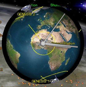
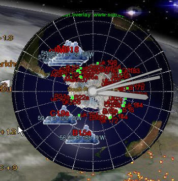
SShuttle ClockWith the Earth Clock from Xentax.com you can make a clock widget for XP and Vista, using maps from this website. The example on the left shows the position of the ISS. You can of course also use the views (Earth From The Sun), (Antarctic) or whichever you desire.


(
DownloadDownload, source: http://earthclock.xentax.com)

2008-09-28

Erupting Volcano in Chile

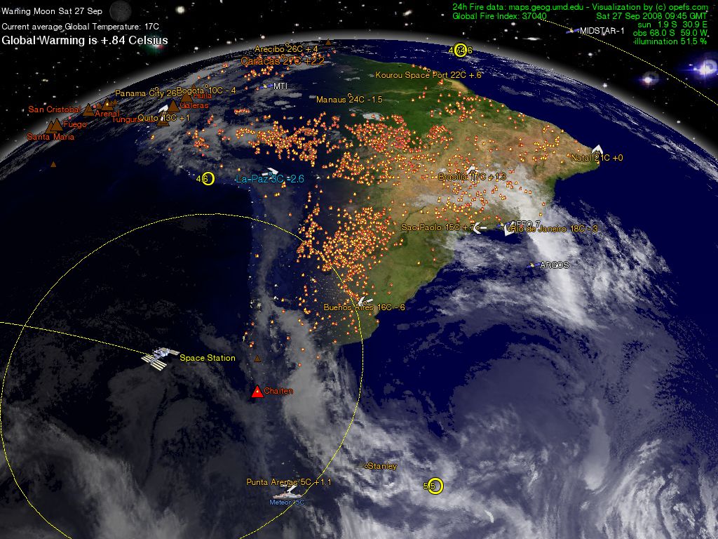
The Chilean volcano Chaiten has been erupting since September 23, 2008. This activity has been registered on the website, when the volcano icon turned from brown to red. A little later, magma flow was detected by the Modis fire detection system, shown by a yellow spot in the middle of the volcano symbol.

On the ground, the small village next to the volcano has been evacuated and a live webcam and video stream from the chilean meteorological office shows the ongoing eruption of the volcano.

2008-09-22

ehabich.info is back online!

Well, it took 6 days, but today "Our Planet Earth From Space" is back online.
I apologize to all for this inconvenience, but a change of provider is seldom totally smooth.

Cheers, Eric

2008-09-21

ehabich.info back online: soon

I have changed the domain administrator and web space for ehabich.info.

The domain transfer will take a few days until it is completed, but then "Our Planet Earth From Space" will be back online.

2008-09-17

Deutsche Telekom is stoopid

The German Telekom has cancelled my webserver package after I cancelled my DSL subscription and phone.

I did this because I moved together with my lovely girlfriend, and for the love of Pete we did not need two phone connections at our place.

Why the Telekom also cancelled my webserver is a complete mystery, because I never gave them the order to do that.

I now have the opportunity to move to a much cheaper webhost, which I have delayed to do until now, because I did not want an interruption of my website service to you.

I hope to have the website back up again soonest.

2008-08-17

Active Volcano display is updated

After it was brought to my attention that Mt. St. Helens was falsely showing on my volcano display, even though it wasn't active for a couple of months, I had to change the data source, away from the Smithsonian Institution.

My data now are from the International Volcano Research Centre, at Apache Junction, Arizona. I thank R. B. Trombley,Ph.D. and his associates for permission to use the data.

Volcano iconsActive volcanoes are shown as brown triangles, and erupting volcanos are shown in red. The name of the volcano is printed next to the symbol in orange. It is not unusual to see quake activity next to a volcano. Inside the triangles fires may be observed, which are lava flows.

Scale of volcanic acitivities:
Volcano Alert Level 1 Vulcano ist restless; Eruption is possible.
(Volcano Alert Level 1)

Volcano Alert Level 2-4 Volcano is erupting or eruptions are eminent.
(Volcano Alert Level 2-4)

Volcano Alert Level 5 Significant eruptions are underway, or explosive eruptions are expected at any time. (Volcano Alert Level 5).

Data from:
http://www.intlvrc.org/alerts.htm
Update interval: twice daily.

2008-07-13

Home Energy Meters

As a method to save on home electricity bills, as well as reducing your carbon footprint (thus helping to save the planet) I have discovered "home energy meters".

Home energy meters measure the electricity consumption at the main electricity meter and transmit the result to a wireless unit, which can be in your kitchen, living- or bedroom.

Thus, if your kids forgot to turn of the TV and Wii in your basement, you know about it and can tell them to turn it off, without first trudging into the basement yourself.

You also know at any time how high your electric bill will be and get warnings when the energy usage is especially high.

I have ordered the Efergy energy meter and I expect it to arrive in the next week here in Germany. I got my unit from here: home-energy-meters

2008-06-23

Piri Reis inspired satellite view of Earth


Here is a bonus for Piri Reis map and "10.000 BC" fans: the Piri Reis map.

My server is presently generating the first issues of this Earth view in azimuthal projection.

http://www.ehabich.info/images/synchro/ep.jpeg

2008-04-17

Piri Reis Map

Not much has been happening the last few months. The server has been running smoothly.
Recently watched "10.000 B.C.".

This gave me the idea of composing a modern analogue of that old map. Presently I'm a bit stumped, on how to realize the necessary spherical distortion.

2008-01-29

Extended Server Outage

I apologize to all for the complete disappearance of the website for over 24 hours. It was caused by my managed server being "managed" by a third party, to include an important "security" update. Apparently the managers forgot to restore the backup, or they forgot to plug the server back in.

Whatever the cause, the website is almost back to normal, except that the domain opefs.com does not yet connect, which is just a small challenge. Most business is transacted via ehabich.info.

Increased lossless resolution
The image for the Natural Earth Map is now a PNG graphics file.
Some old distributions of Internet Explorer may not be able to display PNG files, in which case an upgrade to a later distro of IE can help.

Vista Compatability
All screensavers are compatible with Vista. Please look on the screensaver download page.

2008-01-18

Portable Network Graphics

As the speed of internet connections keeps increasing, it is becoming feasible to use higher quality graphics. The first .PNG map on this site "Our Planet Earth From Space" is the Natural Earth View. The file size increases from approx. 220kb to 1.4mb, giving richer colors, and no more compression artifacts. If the image format causes trouble, drop me a line...

2007-12-26

Color correction

I made a cosmetic change to the display of the maps.
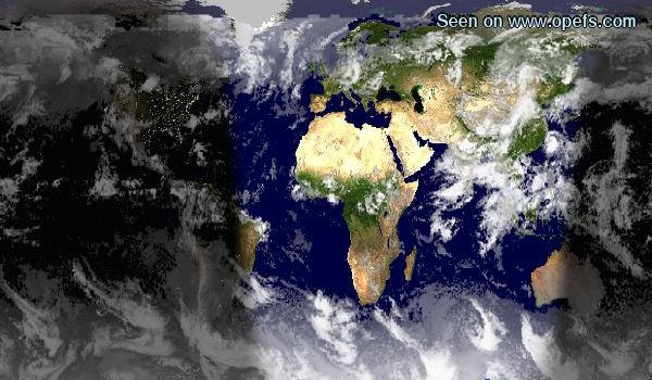
The standard "NASA Blue Marble Next Generation" maps have very dark oceans, as seen on the left.

You may have grown used to the dark, almost black, oceans, but it's not really the way the Earth looks. The new blue shade is shown below the old picture.

Satellite Look Up Tool is repaired
NASA changed the way in which its Spacecraft Master Catalogue is queried. The changes have been incorporated and the relevant pages are fixed.

2007-12-02

Corrected error in the Global Warming index

There was a script error, which calculated the global warming wrong.
The now corrected script shows an above average temperature of +1.78 Celsius at the beginning of December, which is still a lot, but not as roastingly hot as the +11 something Celsius ...

2007-12-01

High temperatures at the beginning of December

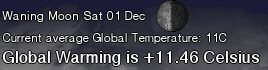
The first December shows a Global Warming of 11.46 Celsius. It must be remembered that this means that the average temperature for the whole month of December is 11.46 C above average. The temperature will hopefully progressively fall until the end of December, because the planet is entering the winter season.

Exactly why this should be so, is not entirely clear to me, either. I suspect that there is more landmass in the northern half of the Earth than in the South. Or because there are more weather stations in the north to record the temperature.

2007-10-16

Sea Ice

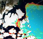
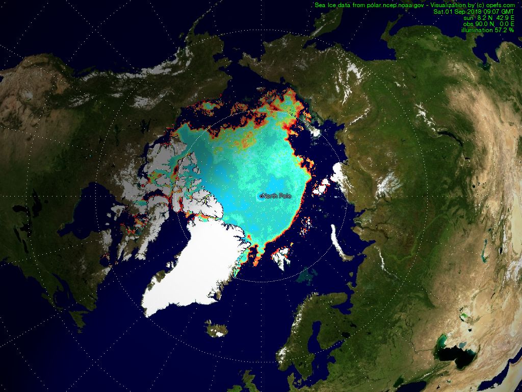
Sea IceLegende der EiskonzentrationThe extent of the Arctic ice field can be observed on the large North Pole map. That map can be opened by clicking on the Polar region.

If polar bear Knut's cousins can still tread safely on ice and in which regions their habitats are threatened by melting pack ice, can be gauged with the help of the color scale.

The origin of the sea ice data is a satellite based passive microwave sensor. The Polar Ice Team of NOAA uses a NASA formula to derive their measurements.
The formula works by comparing the reflective properties of the various types of ice. Strong winds and heavy rains can falsify the data.
According to Russ Page (of the Anchorage WSFO) this happened for instance on 8 January 1997, when heavy 60 knot winds pounded the Bering Sea. In summer, sometimes puddles of water on the ice can lead to underestimating the ice thickness.
Data source : http://polar.ncep.noaa.gov/seaice/

2007-09-23

The North West Passage is shut!

Whilst these news possible are not featured as prominently in the media, after only a week of being passable, the North West passage is frozen closed again.

For fairness I thought I should give these headlines as much space, as the news of its opening. It's still going to be a long time before regular shipping will be able to take a shortcut over the North Pole.

It is still a warning however. The introduction of the "Arctic Screensaver" will make it possible for everyone to keep a close watch on what's happening in the far North, without media bias.

  • Improved Zoomability of Natural Earth Map
    Since a few weeks it's possible to click the Earth Moon image on the start page to zoom to the "Natural Earth Map". Further zooming now takes you straight to the full screen continental maps.

2007-09-16

The North West Passage is open!

At the beginning of the last century many explorers left their lives in the Arctic regions, searching for a way around the Northpole, to find a shorter way to travel to Asia by boat.

The changing climate has now opened this fabled sea route for the first time in human memory. Container ships will be able to get even faster and cheaper from and to the Far East and China.

To keep up with developments in the increasing important developments in the Arctic region i spent today tweaking the Sea Ice image from MMAB Sea Ice Analysis Page for use on my maps.

The full map can be seen here. I've not had time yet to incorporate the map into the site further.

2007-09-10

No current fire data from Modis

There are problems with the Terra and Aqua L0 data feed from MODIS Rapid Response for the Fire data. This means that the fire data displayed on my website are out-of-date!
The last update happened on 7. September, 14:30 GMT.

Naturally, as soon as the proplem is fixed, the data will update again.

2007-09-03

Testing the Climate Change Index

To show that my Climate Change Index is not a completely without value, I give a few examples of its merit:

COMPARISON WITH OFFICIAL CLIMATE CHANGE DATA
"The global average air temperature near the Earth's surface rose 0.74 ± 0.18 °C (1.33 ± 0.32 °F) during the last 100 years." source: http://en.wikipedia.org/wiki/Global_warming

This measurement was arrived at in the report of the IPCC, using error corrected data of tens of thousands of weather stations over 100 years.

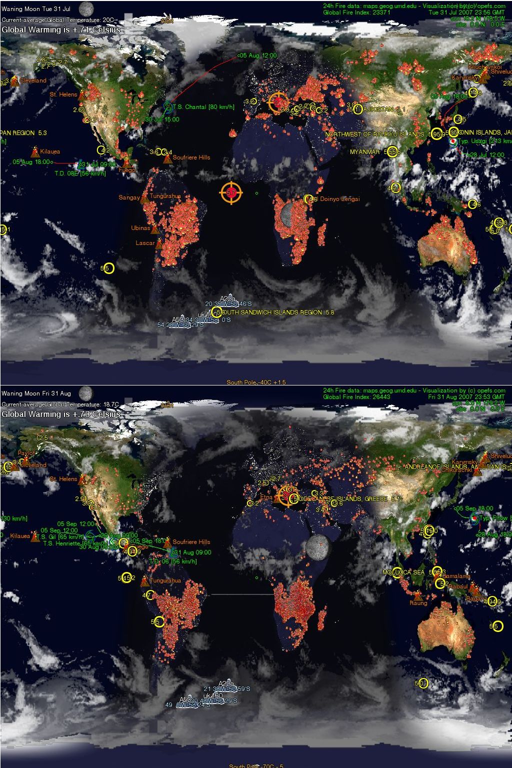
click for close-upFor comparison, here are the latest available full month data from my calculations and sampling of 130 stations. (Older data are archived in DivX movie format and can be downloaded from here: http://stage6.divx.com/Climate-Change).
My results show a temperature rise of +0.71 to +0.73°C.

The difference to the official value of 0.74° Celsius is 1% to 3%, a mean difference of 2%, which I think is amazingly close.

2007-09-02

Climate Change Index

Image 1(Image 1)The display on the left is visible on almost every map of this website. The current average global temperature is calculated from averaging the temperatures of approx. 130 weather stations. The data for this are from http://weather.noaa.gov/.

The Climate Change Index (+1.6° Celsius) is calculated from the deviation of the longterm average temperature of the 130 weather stations. It is thought that even though this is only a small random sample of global weather stations, it will give a general idea of global temperature trends.

Image 2(Image 2 ) We all have heard that supposedly the glaciers in Greenland are melting, because of global warming. Is that true? Here we see the temperature at Thule Airforce Base in Greenland on the 2. Sept. 2007, it is 3°Celsius. There is a second set of figures, the climate change indicator: +5.3. 5.3° Celsius was on September 2nd the temperature deviation from the norm. The norm is the "many years average" for September for Thule. As you can see here, the average September temperature in Thule between the years 1946 and 1990 was -1.8° Celsius.

Then you ask, why does the deviation from the norm not show this: "+4.8"
(as -1.8°Celsius to 3°Celsius equal +4.8°Celsius) ?

Image 3 (Image 3 )The picture on the left shows the temperature at 11 GMT the day before. It was 4°C and the climate change indicator shows a deviation which is to be expected:
(as -1.8°Celsius to 4 °Celsius equals +5.8°Celsius).


The reason for the differing values is, that the fluctuating daily temperatures are recorded every hour and the running average is calculated. The running average is then compared to the monthly average, which then is displayed as the climate change indicator.

Like this we always get a fairly accurate approximation of the change from the monthly average. However, as the part month averages are compared to the whole monthly average, it does mean that the climate change values get more accurate towards the end of the month. At the beginning of the month there can be strong fluctuations.

From 1. September to 30. September for instance, we expect a decreasing temperature in the northern hemisphere, which means that the values of the climate change indicator should decrease until the end of the month. The values will be exactly correct on the 30. September at midnight, for the place indicated. The results before then are neither mathematically nor climatologically quite correct, but it is hoped that they can help to detect temperature trends.

Image 4 (Image 4) There can also be instances when the climate change indicator shows negative values (global cooling). In any case, when the temperature deviation from the norm is more than 2° Celsius positive or negative, then the fontsize increases and the color changes to indicate hot or cold spots. The hot-/coldspots are highlighted only from the second day of a new month, to have a minimum sample of 24 hours.

Update interval of these data on the webpages: every 60 minutes.